CAnD3

Mapping the Intersection: Average Wait Time for Housing Vouchers in Relation to Minority Household Percentage
(With Bertram Melix and Megan Skowronski)
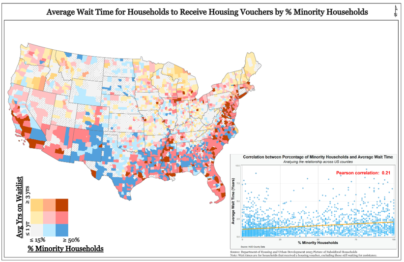
As a fellow of CAnD3, I coauthored a data visualization that explores the relationship between average wait times for housing vouchers and the percentage of minority households at the county level across the United States.
Here we have produced a bivariate map of the United States, illustrating the average wait time for households to receive housing vouchers, overlaid with the percentage of minority households using county-level data.
You’ll notice as the percentage of minority households increases, there’s a slight tendency for the wait time to also increase.
In our visualization, we deliberately chose not to control for population density to highlight the impact of minority density in urban areas. By doing so, we aim to accurately portray the correlation between minority population and wait times for housing vouchers, without diluting the influence of urban demographics on this relationship.
As you can see, there’s a graph to the bottom left which indicates a relationship between the average wait time for housing vouchers and the density of minority households. While this general trend may be weak across the nation, here we have identified the spatial distribution of inequities.
It is clear that coastal regions, encompassing both the western and eastern coasts, demonstrate a significant clustering of prolonged average wait times and notable densities of minority households. These regions call for specific focus and increased investment in supplementary housing support measures, namely in the supply of available housing units.